Website design is full of buzzwords, phrases, scary acronyms, and technical terms so it can seem a little bit overwhelming when you are browsing the web or talking with your website designer. If you ever feel a bit lost this is the first in our ‘understanding your website designer’ series, this time covering website design layout terms but eventually we will tackle the whole world of website design jargon.
If we’ve missed anything out let us know in the comments and we will be sure to add it in or include it in a later blog post.
Home page: The main page of any website – it’s the page that comes up when you type in the domain name of a site!
URL: This is the name for the address of a page on the internet – like https://www.motacilo.com for example!
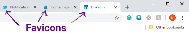
Favicon: A small logo that comes up next to your site name in a web browser.
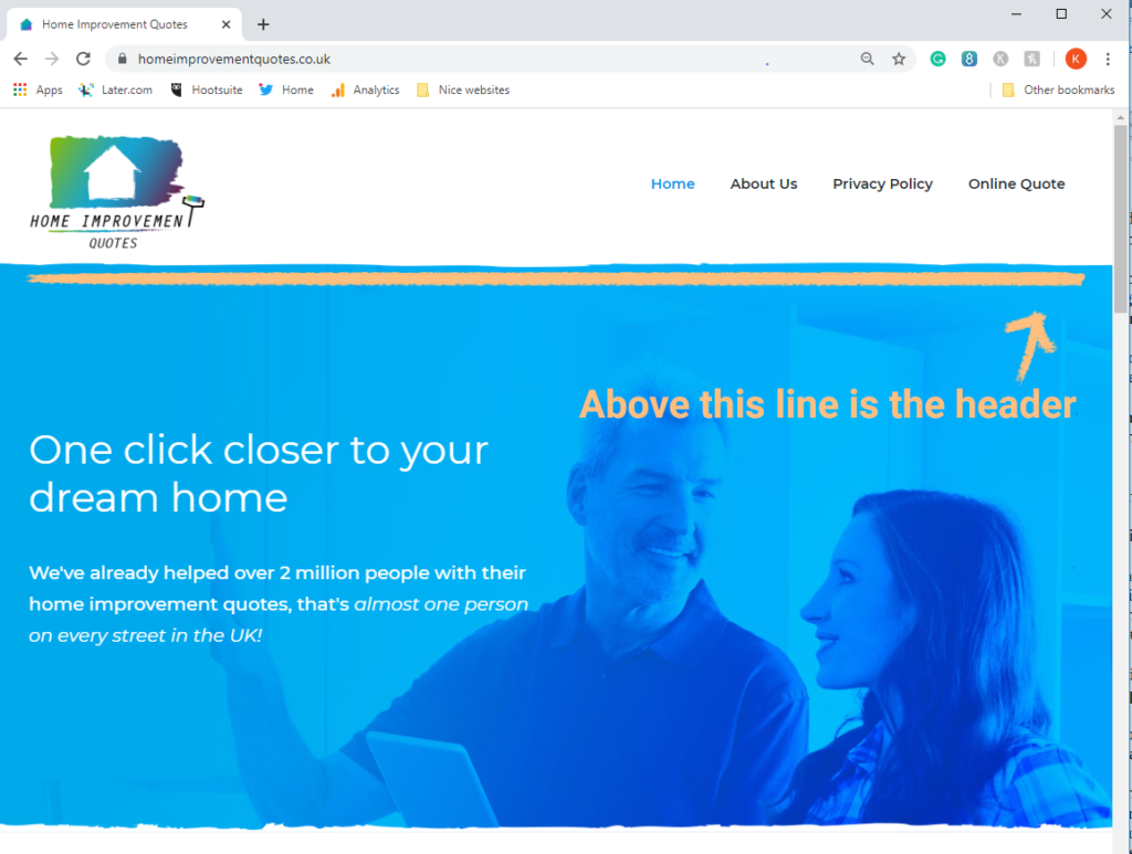
Header: The top portion of a web-page that will usually stay the same across the entire site. It usually includes a logo and a menu for navigation.
Menu: A menu is used for navigation around your website! A website often has a main menu within the header of the web page, and other menus around the site in places like the footer.
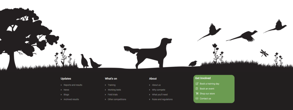
Footer: The very bottom of a website, where contact information, navigation and copyright information is usually location. This, like the header, usually remains the same across any website.
(Check out below an illustrated footer example that we created for one of our clients)
Static layout or fixed-width layout: This means that the page layout is set to a width, that does not change with browser width. This is how the internet was originally built but it’s no longer considered best practice within website design because a website should look as good on every sized screen and have an adapted layout for use in mobile design.
Responsive layout (mobile-ready design): This means that the layout adapts for different page sizes, tablet screens, and mobile devices. It ensures that your website looks just as good on any device and page width!
Above the fold: This term originally referred to newspapers, when all newspapers used to be folded in half once they hit the news-stands. It meant that to grab attention and sell their paper they needed to put the most interesting stories and biggest headline ‘above the fold’.
With websites, it basically means the same thing, except the fold, is the top part of the web-page that is shown when a user comes to the site. This should be a visually interesting and attention-grabbing area of your website, to encourage users to scroll down and find out more.
Call to action: This, often abbreviated as CTA, is a marketing term used to refer to the way that you insight action from your users or clients. On a web-page, the call to action is often a button or asking a user to fill out a form/provide details or get in touch for a quote. It is essentially a prompt to get a user to take a specific action.
UX designer: This stands for User Experience designer, these people work to design a website (or an app or product) by thinking about the user’s experience on the site and make this a key part of the design. They work on the design, user research, usability testing, content strategy, the hierarchy of information on the site and more. You can find out more about that here.
Colour profile/style guide: The colours your company use, or those that are used in your logo/ other design stuff make up your colour profile as a business. It’s important to keep things consistent across your materials, so your website should also follow your colour profile.
We hope that you found this comment useful and be sure to tell us if we missed any website design layout terms in the comments below. And, let us know if there is anything else you would like us to post about – thanks for reading!